When presenting data it is very tempting to elaborate too much and get lost on the way. Sometimes there is a lot of data so it is easy to build complicated representations of it. Sometimes is the opposite, there is not much but we want to get a lot of value out of it so we build up to compensate the lack of content, or something in between. One way or the other, we believe that regardless of the complexity of the data its visualization must be simple enough to communicate a message. Therefore we want to share some tips to deliver efficient messages.
If it is simple, keep it simple!
Think on the basic message that any web page wants to communicate to a user, regardless of the content itself, a page must give the user information about his/her interaction with the site. Namely what content is interactive (what’s clickable), visited URLs, etc., this is done in every site using subtle style changes and rollover effects that give a sense of interactivity. It is vital information that has to reach the user but it should not dominate its attention. It is also conceptually simple, it should stay that way. Scroll through this site of the making of the movie Life of Pi, the content is amazing and it feels very interactive although you only have to scroll, Simple!
If it relates or correlates to a straight forward concept, use it!
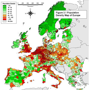
A message is much more efficient if it is associated to a known concept. Think on population statistics or energy consumption around the globe, the impact of the message delivered is much stronger if data is displayed over a map than in any chart form.
 When possible use proportions.
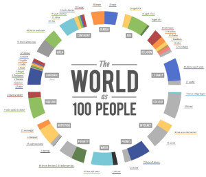
Comparing is one effective way to highlight data, think of population distribution, it is easier to communicate that kind of information using percentages to build proportions than to take absolutes. Saying “we earned 10 millions” is subjective, on the other hand, saying “We earned half or twice as much as last term” delivers a message. The World as 100 People is a great example of the use of proportions to deliver a message.
Identify your aim and target it!
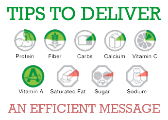
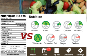
Same data can reach different audiences in different formats. Identify what is the aim, who is your audience. If you aim for a decision you will need options and comparisons, if you want to cause a reaction look for contrasts and care for detail, if it is a message for later or continuous use, focus on simplicity and application. Think on nutrition facts, they are there in almost any product you can think of, however it is rare seeing someone actually serving a measured portion of olive oil, or any product for that matter! Nutrition facts have to be on the products by law but as a user it would actually be more useful to have them for meals rather than products, it gives you more information of what you are eating and is practical for continuous use. Zipongo, a company focused on improving health through food, masters the nutrition facts feature.

